Overleaf is a scale-up with the goal of making scientific and technical writing simpler and more collaborative. Just like Google Docs, but for scientists.

The company was going through a period of rapid growth: user numbers had climbed from around 3 million to over 20 million in just a few years. This kind of growth is wonderful for a business, but it creates predictable design and technical challenges.
The symptoms were familiar to anyone who’s worked at a fast-growing startup. Overleaf had been built quickly, favouring (rightfully so!) shipping features rather than long-term maintainability.
I led a small but growing design team through this period, building their capability to deliver both the design system and ongoing product features.
Some of the problems…
The frontend styling stack
The frontend styling stack included a heavily customised Bootstrap 3 build. Bootstrap does have some “system” elements, such as components and variables; and, with a somewhat consistent customisation, we had what we could call a proto-design system.
This was misleading, though. It created a false sense of systematisation. Although a primary button was consistent with other primary buttons, it existed alongside many custom components and plenty of one-off elements (added over time). To make matters worse, the Bootstrap customisation was implemented inline, which (from an engineering point of view) made it almost impossible to upgrade automatically or with little manual effort.
Inconsistency
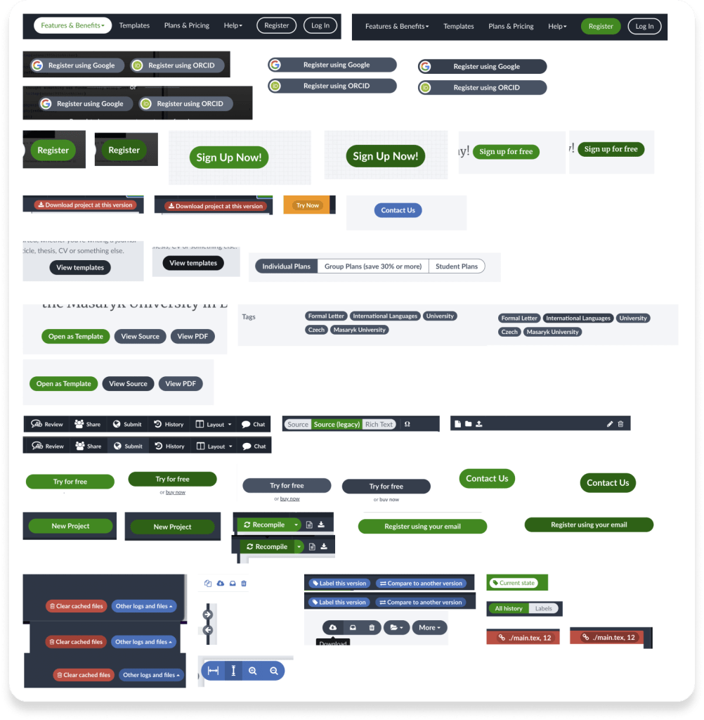
The typical example when systematisation is lacking is inconsistency. Inconsistency was an issue within the product (i.e. two elements that should look the same don’t) but also between design specification and implementation (what was designed ≠ what was implemented).

This had a direct impact on the end-user: the lack of a consistent and predictable user experience. It also affects speed of development.
Accessibility
Accessibility was also affected. Some design choices (typical example being colours) were not ideal.
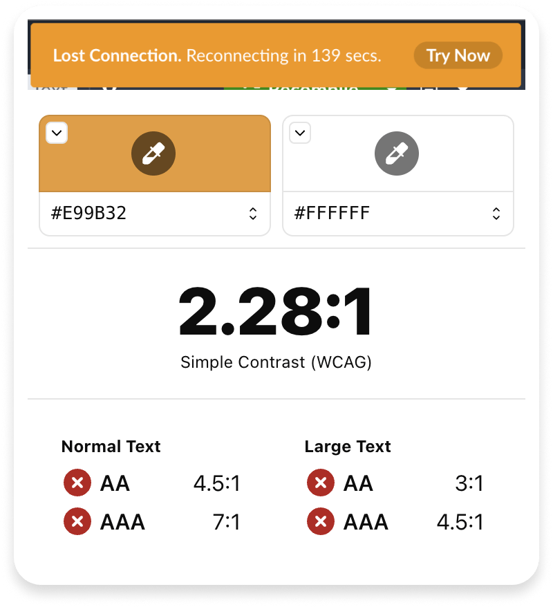
failure to meet even AA compliance
Ambiguous communication
Ambiguous, error-prone and inefficient communication between design and engineering was also one of the key challenges we faced. It’s not very efficient to produce exhaustive design specs, documenting every single design decision. It’s not very efficient to communicate colour codes and/or pixel values.
Arguably, even beyond consistency, streamlined communication is the most significant efficiency gain in implementing a design system.
… and the actual, biggest challenge
Overleaf had plenty of ongoing and upcoming initiatives with clear, commercial impact. Product development couldn’t stop, and it was hard to justify allocating a team to work on the design system.
The clear challenge was how to implement a design system while prioritising product-led growth.
Approach
We have defined an approach based on three pillars, which the team executed collaboratively with engineering:
Anchoring
Integrating design system work with planned feature work and refactoring efforts. A few examples:
- We have incorporated design system work during required accessibility updates to meet client standards.
- We have combined design system implementation with frontend styling stack modernisation, achieving both objectives simultaneously.
Evangelism
Get buy-in from the different stakeholders. Examples:
- We have emphasised efficiency gains, shared ownership, consistent terminology and clearer UI communication with engineers.
- We have emphasised how accessibility compliance directly supports client requirements and strengthens B2B sales propositions.
Prioritisation
Focus on the highest impact changes first. Examples:
- We have prioritised addressing a significant part of our accessibility issues through systematic colour implementation.
- We have prioritised consolidating buttons due to their prevalence throughout Overleaf’s UI, for higher visual and efficiency impact.
Audit
An exhaustive audit was one of the first steps. Through manual and automated processes, the team identified all the existing visual options and components, capturing all the variations.
This was used as a baseline upon which the team could consolidate and systematise.
Shared language
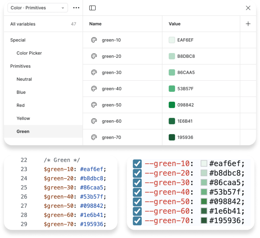
A design system establishes a unified vocabulary where PrimaryButton (a component) or green-50 (a variable/token) mean the same thing to designers and engineers.
Technical implementation details (hex codes, spacing values, border-radius) become abstracted into meaningful, easy-to-reference tokens that both teams can access.
This shared terminology eliminates misinterpretations, reducing the need for back-and-forth communication.
Shared ownership
We championed a model where design system ≠ design-team only. Collaborative ownership reduces friction between design and implementation.
Engineers are equal stakeholders in the design system, contributing code patterns, implementation guidelines, accessibility solutions, and ideas.
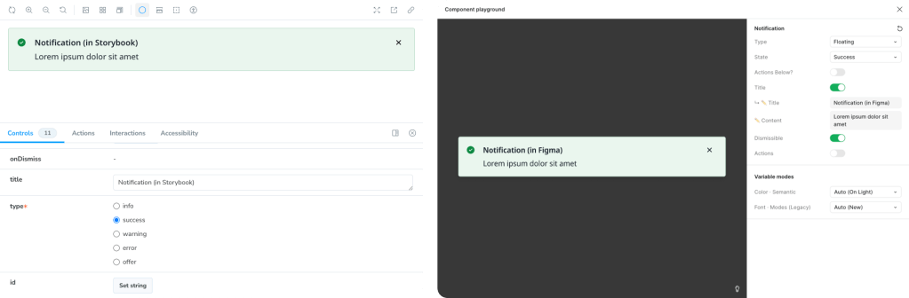
Storybook (code-based component development/documentation tool) was used alongside Figma to ensure alignment.
Outcome
Working with the team, we created a tiered approach to the design system, allowing gradual evolution and implementation, as well as separation of concerns.
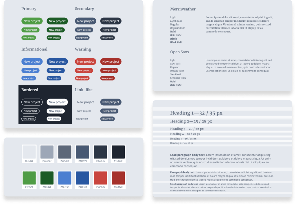
Tier 1 — foundations
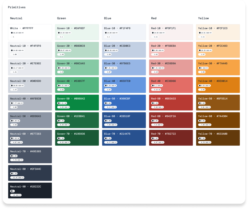
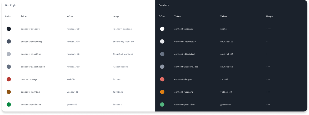
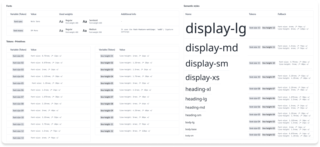
The baseline of the shared language, these are the foundational and reusable design attributes (design tokens), implemented as variables, both in Figma and in code. Including:
- Colours
- Spacing scale
- Grid & responsive breakpoints
- Typography scale
- Etc.
The design team created and maintained these tokens in both Figma and worked with engineers to implement them in code.
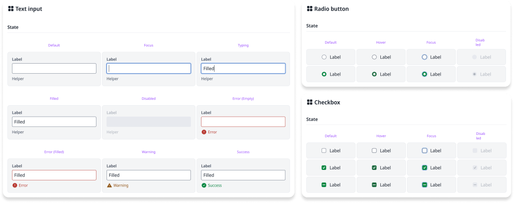
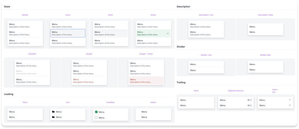
Tier 2 — components
These are the reusable user interface elements, adhering to the foundations:
- Buttons
- Form elements
- Menus & menu items
- Etc.
The designers worked alongside engineers and, wherever possible, have aligned the components with Bootstrap to minimise effort (and friction).
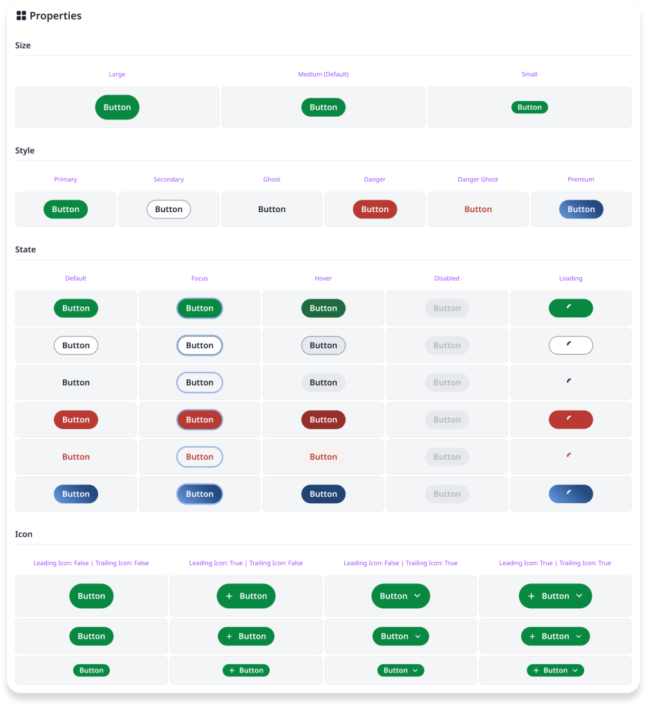
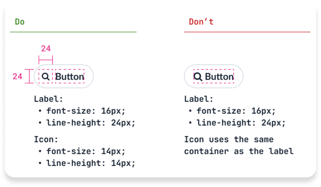
To foster a shared language, the components (e.g. button) and their properties (e.g. type: primary) use the same nomenclature, in Figma and in code.
Tier 3 — patterns
These are the defined arrangements of components for a specific, often repeatable, purpose.
- Key navigation (main navigation; footer)
- Form validation
- Upgrade/upsell prompts
- Etc.
The design team documented these patterns with clear usage guidelines, working with engineers to ensure consistent implementation across the product.
Impact
This initiative allowed us to grow the design team’s strategic capabilities. The designers moved from execution-focused work to understanding and contributing to systems thinking, which elevated the team’s impact across the organisation.
Communication between design and engineering has become more efficient. There’s less back-and-forth because we have a shared vocabulary and agreed-upon standards. The design system removes ambiguity — the vast majority of the time, we simply follow the design system decision rather than debating specifics.
The team delivered significant improvements to accessibility across Overleaf. Beyond simply fixing existing issues, the accessible defaults mean that new features are more accessible from the start — the benefits compound as the product evolves. This scales in a way that ad-hoc fixes never could.
Pragmatically, we know that engineers sometimes need to make UI decisions, particularly when the design team is stretched. Providing a framework for these decisions means they can build interfaces that feel consistent and on-brand. This doesn’t replace design work, but it ensures consistency even when designers aren’t directly involved in every decision.
As Overleaf went through a reorganisation as part of Digital Science, this work has taken on broader significance. Our structure is defining the baseline for the Digital Science-wide design system work that is now starting across the organisation.
